Tips for using colour in website design
From time to time, we’ll invite web professionals to guest blog on the SatelliteWP website. This week, Alison Knott, a web and branding consultant at Alison K Consulting based out of Halifax, discusses the use of colour in web design.
Using colour in website design can seem like a small detail. Often, we take colour for granted: use the same colours as the logo and call it a day. When we stop at this step, we miss out on better user engagement. Mediocre colour use in websites can result in less buttons clicked, less items purchased, less content read. Don’t you want better engagement on your website?
By being more effective with colour, we stand to increase ROI. Websites are interactive assets, not brochures, after all. Outshine competitors by reading some of my tips for using colour effectively in website design.
Insure you picked the best colours possible
As a website owner, you reserve the right to update your colour scheme whenever you want. There’s no need to reinvent the (colour) wheel when it comes to inspiration.
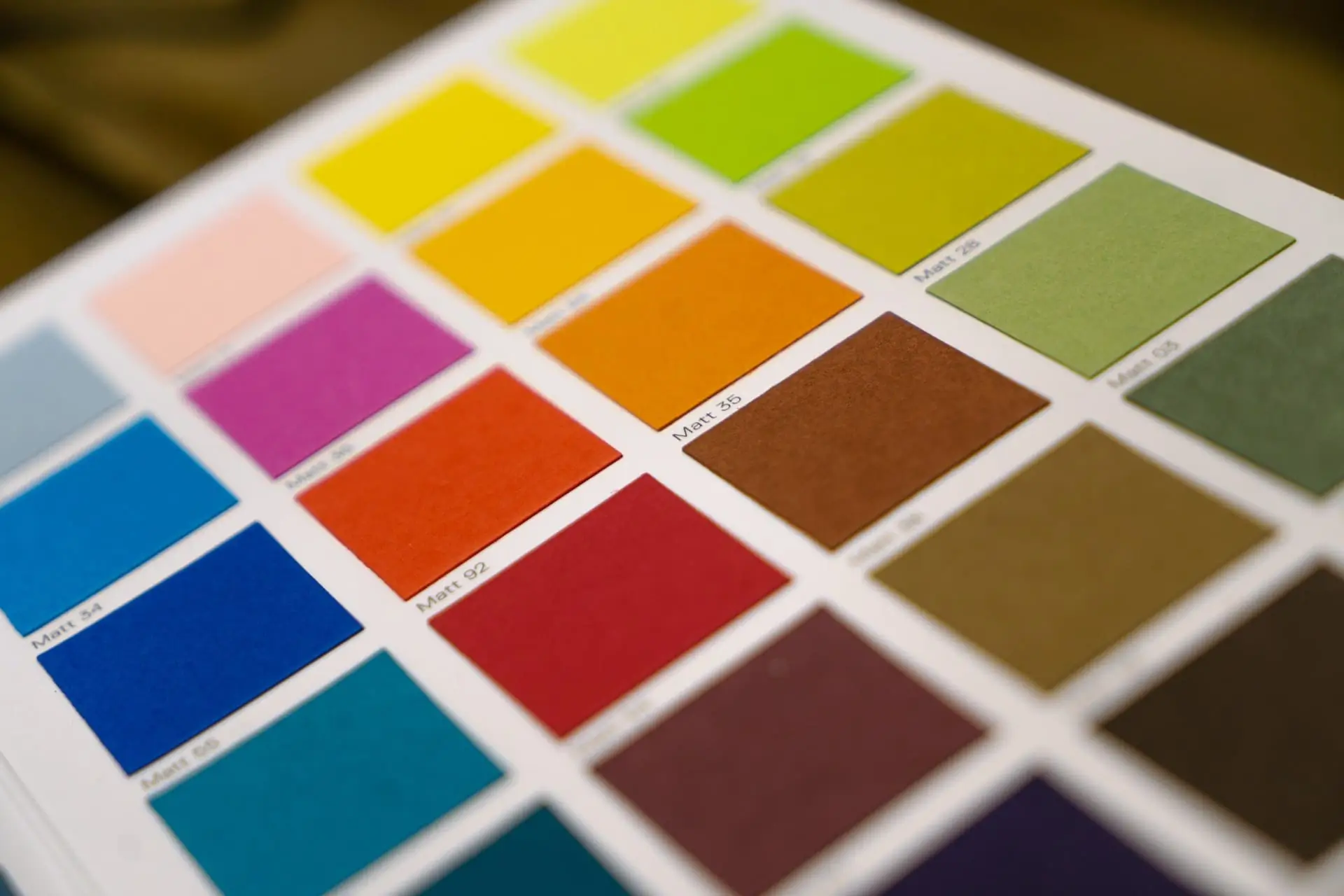
You want to have at least 4 colours to work from, known as a colour palette. We all carry some preference to how colours should be combined. A quick glance at our wardrobe confirms this (black, black and more black in my case). To insure you pick the best colour combinations possible, I recommend branching out and looking through lots of inspiration. Pick two or three palettes and then narrow it down to the best combination.
Thankfully, the internet is full of useful resources for those of us who don’t have “an eye for colour”:
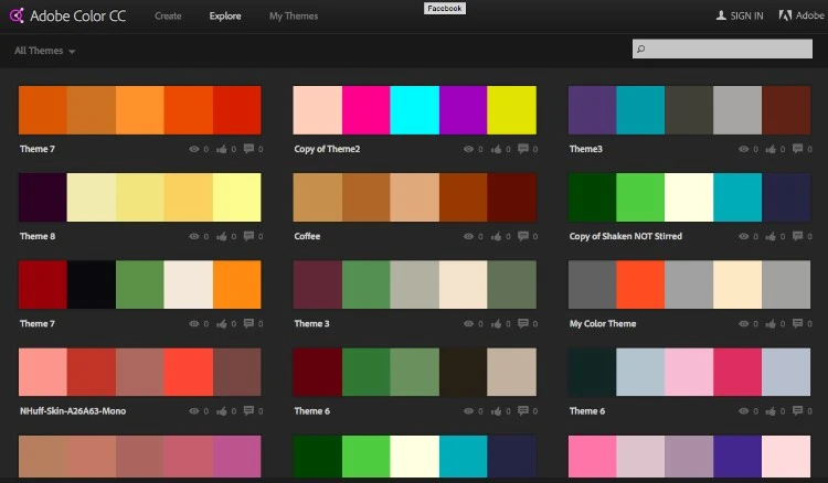
Adobe Color CC
Adobe Color CC is my go-to website for discovering new colour combinations. You can input your own starter colours and then tweak the wheel to reveal different harmonies (analogous, triad, etc). Both HEX and RGB values are available.
For more inspiration, click the “Explore” tab to see the thousands of palettes other people have come up with. You’ll be amazed at how many versions of “sunset” exist.
Website Colour Schemes by Visme.com
This blog post by Nayomi Chibana is a few years old, but remains pure gold (#FFDF00).
It takes screenshots from websites and matches a palette to them, complete with hex values. What I love about this post is the variety of industries sampled, and you see how the colours hold up in application. Sometimes we pick great combinations, but when applied to typography and content sections, the results can be less than desired. Screenshots help us to envision how our own content would look with these colours applied.
Check contrast and other legibility tips
No matter how nice colours go together, if content is hard to read by users, the design fails. Website content legibility should always take priority over aesthetics. Additionally, not everyone sees colour combinations as clearly as you may, so be sure you considered your audiences’ comfort.
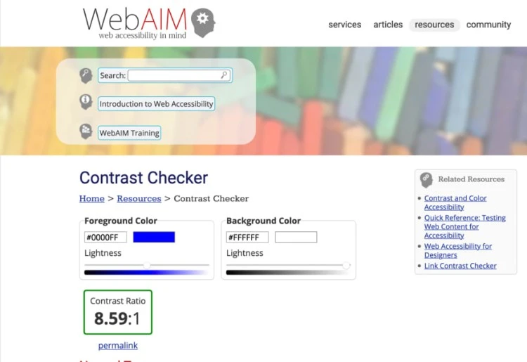
Use Webaim.org to check contrast
Did you know that 1/200 people identify with having impaired vision? Insuring high contrast is one way to meet their needs.
A very simple but effective way to check it is via Webaim.org. You plug in the HEX value of your text colour and background colour, and see where it fails and passes. If your colour doesn’t pass, you can move the contrast slider up and down to see a close match. Often, you can change the colour slightly without ruining branding standards.
Don’t use coloured text for main bodies of text.
You may be tempted to use coloured text once you learn CSS or have a WordPress theme that gives lots of design freedom. Stop!
Main website content should be black text against a white background. Most books you own have this same colour combination for a reason – it’s super high contrast.
Reserve coloured text for content that’s short and set in font larger in size than your body content. Headings, short pull-quotes and links are ideal.
Limit how often you use reverse text
Reverse text is when you use white or light text against a coloured background. I often see people go a bit overboard with these. While a purple background with white text may look cool, it can fail contrast tests. No one wants their readers to have to squint!
Use reverse text for one section per page design if possible. As a lead-in to the main content, or to break up your design for a call to action such as signing up for a newsletter or downloading a freebie. Again, set text size larger than your body text in this instance.
Use brand colours sophistically
Don’t fall into the trap of making every element on your website the same colour as your logo. It results in a lack of visual hierarchy in your site design. Visual hierarchy is an important design principal that helps users understand the priority order of content on a site.
I like to think of page design being broken into three parts: most important, second important, third important. It’s not enough to denote hierarchy by the order of things, but also by how much visual space they take up. The colours your chose can play up and scale back the importance of certain site elements:
Avoid brand colours in site structure elements
If you’re working with a limited colour palette, or your logo is only one colour, consider leaving the header, navigation and footer areas white or black. Then, set your logo as black or white. This frees up your main colour to be used for contextual elements like buttons or links.
Reserve an accent colour for action items
Your brand may have two very prominent colours, which you’ve decided to use everywhere. Main content blocks such as headers, your buttons, and your links. The result? Everything has the same hierarchy. Bleh.
Choose a completely different colour for the most important interactive elements on your site. We call these accent colours, and they can complement your existing brand colours or be totally random for added hierarchy. Be selective when you use this colour: reserve it only for crucial elements, such as a “buy now” button or link to a whitepaper.

In summary
Taking a few extra steps to consider colour can result in a more professional website. By applying these tips, you help your content speak immediately to your audience, resulting in the level of interaction your website deserves.